Non-Profit Responsive Web Redesign
The Adventure Bags website site showed lots of opportunity for re-organization. The information needed to better feature the mission, and allow easier ways to donate to help kids in crisis.
Tools: Adobe XD, Adobe CS, Miro, Flowmapp
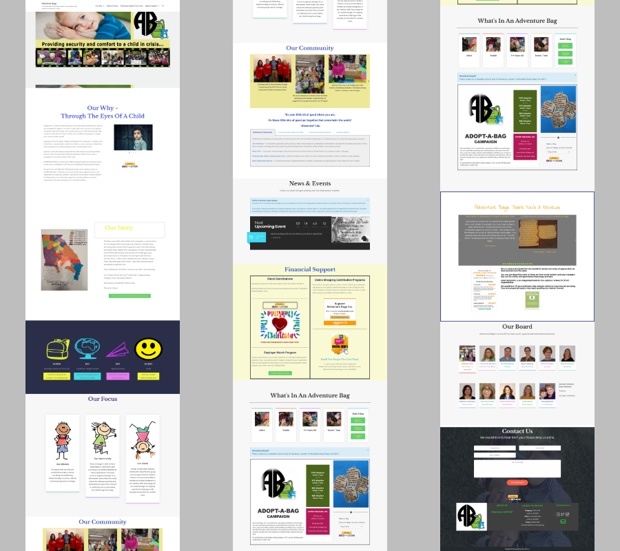
Existing Site:
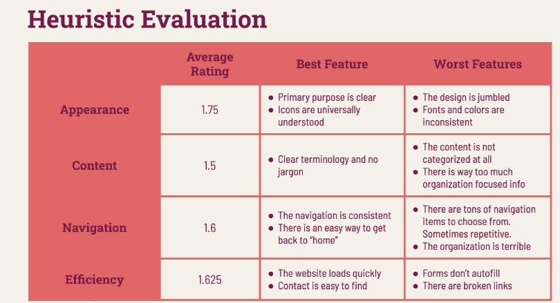
Heuristic Evaluation:
This allowed me to evaluate the current site, and see what can be improved on. I used a scale of 1-3 for this evaluation. The site scored heuristcally low.
Research Planning:
After first evaluations, I was able to create a research plan where users will answer general questions about their interactions with non-profit websites; in order to learn more about a typical user. And then have them execute tactical requests on the actual Adventure Bags website to identify UX pain points.
-6 in person interviews.
-22 people answered our online survey.
Affinity Mapping:
To organize the survey and interview data, I used an affinity map.
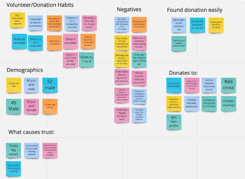
A few key findings from the research we found were:
- A lot of interviewees weren't sure of the mission immediately when landing on the home page.
- The donation page wasn't seen as "professional".
- Website was horrendous.
- The layout of the site was overwhelming and frustrating.
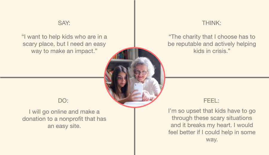
Empathy Map:
Used an empathy map to help empathize with what our users would say, think, do, and feel.
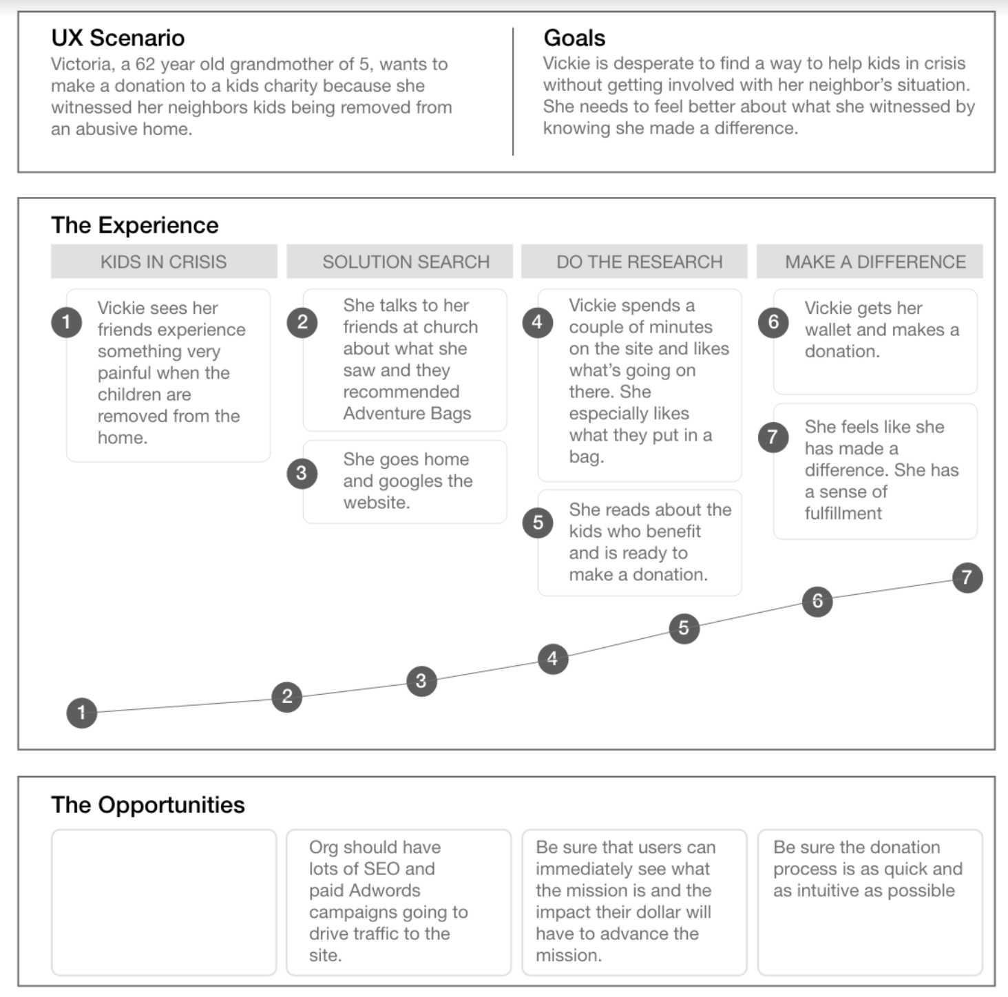
User Experience Mapping:
"Victoria, sees friends at church, who let her know about adventure bags, goes online and is able to read over the mission and decides to make a donation and achieves a sense of fulfillment".
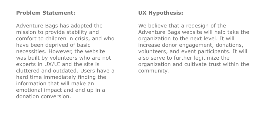
From the research data and empathy phases I was able to come up with a problem statement and the UX hypothesis seen below.
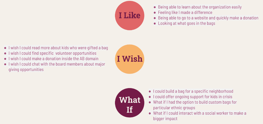
Brainstorming:
To begin coming up with Ideas I used an "I like, I wish, what if" diagram to list out the potential wants, needs and features to include in the redesign.
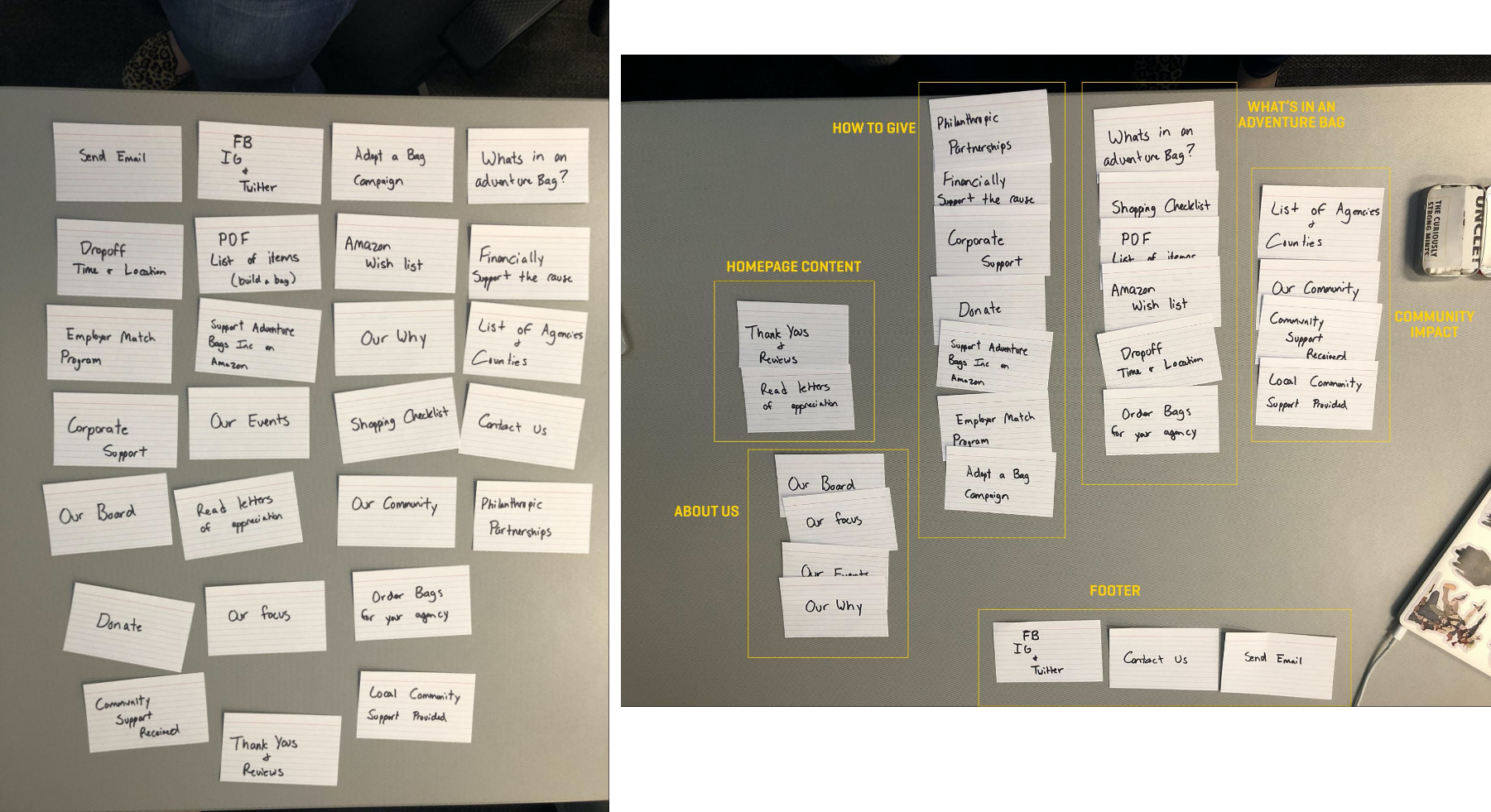
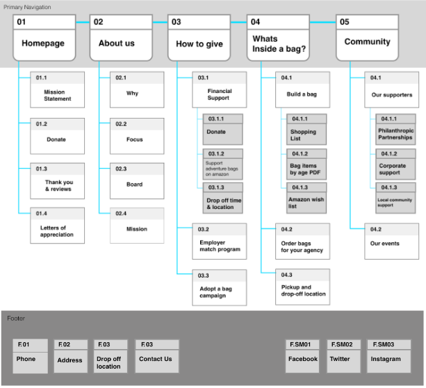
Card Sorting & New Sitemap:
I used card sorting to come up with a new navigation for the Adventure Bags site. Categorized all the links from the one page existing site and reorganizing them to create a new sitemap.
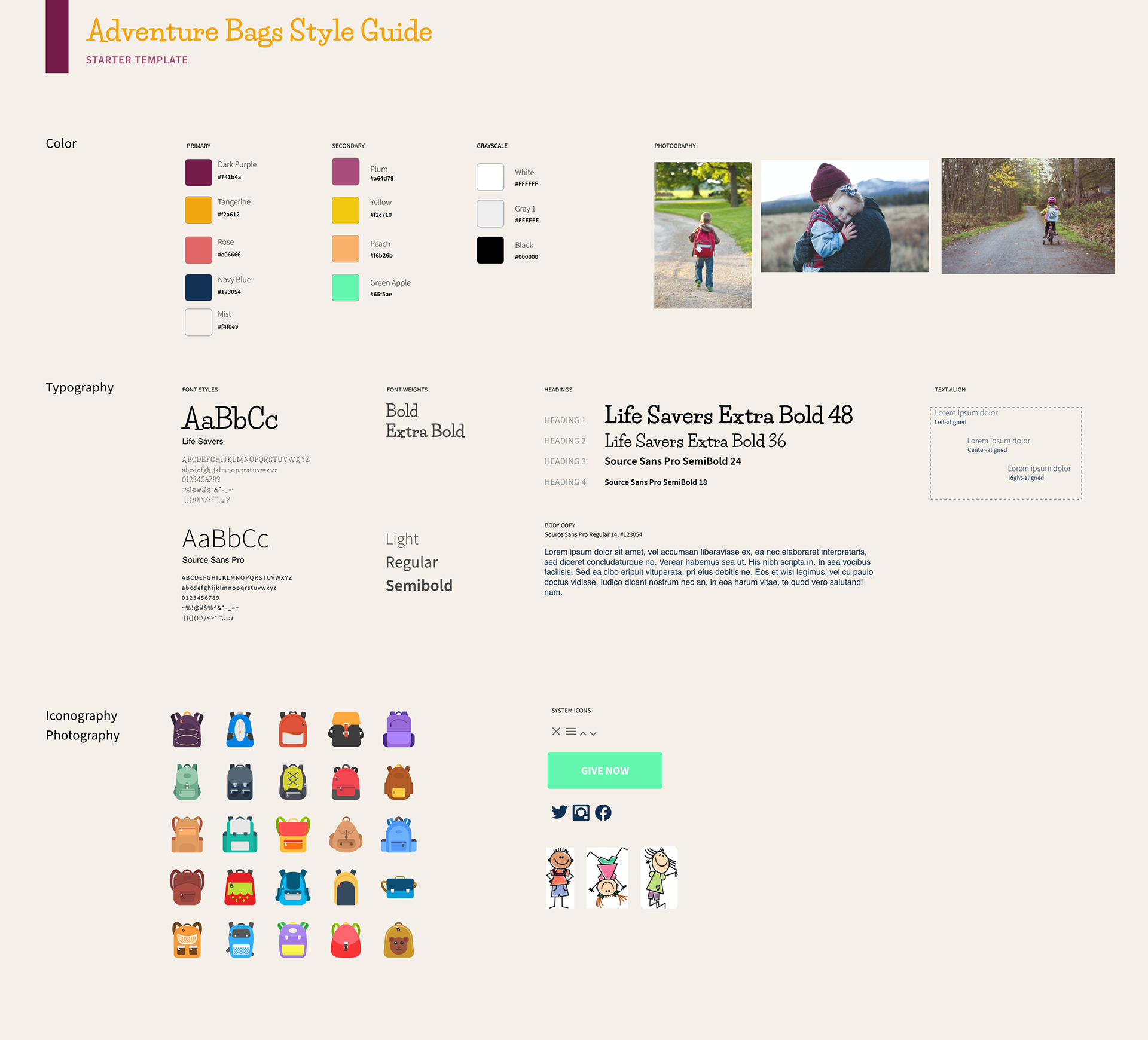
Style Guide:
We created a style guide for the new site filled with bright colors and easy to read text with a tone that feels encouraging.
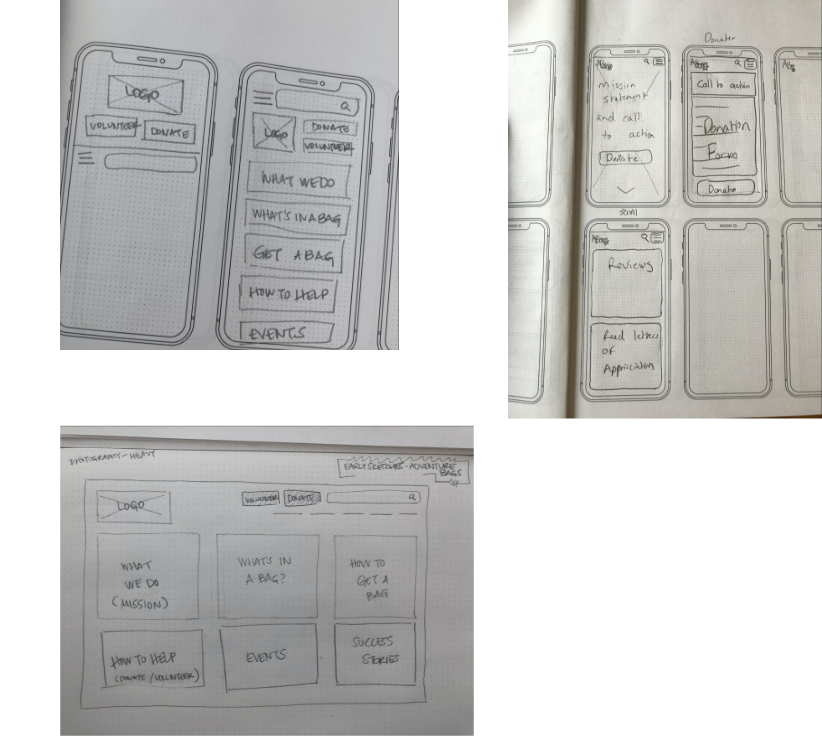
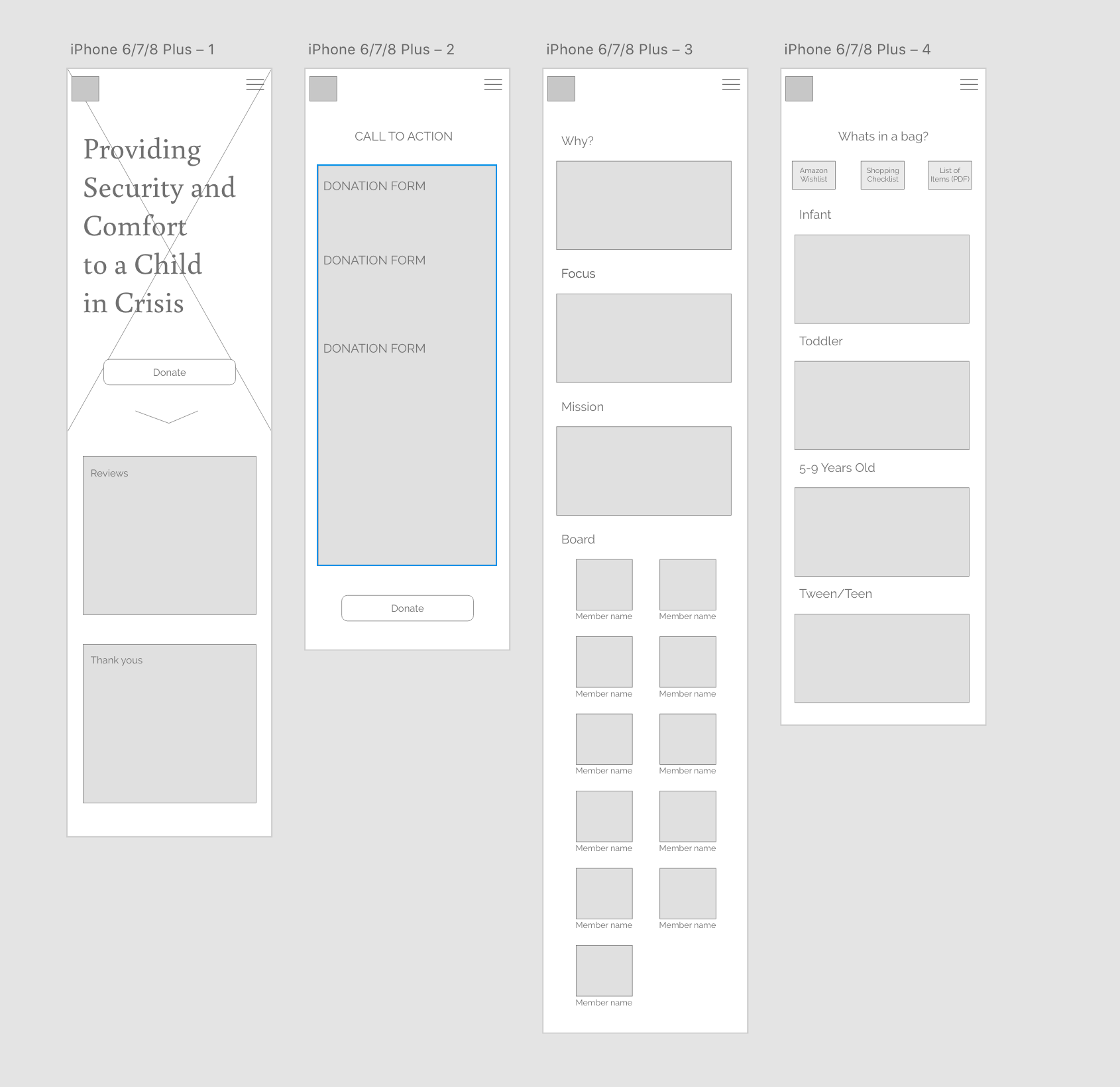
Sketches & wireframes:
At this point, we started to sketch out wireframes for the mobile and desktop sites. Ideas were sketched on paper first, and then translated to digital wireframes afterwards.
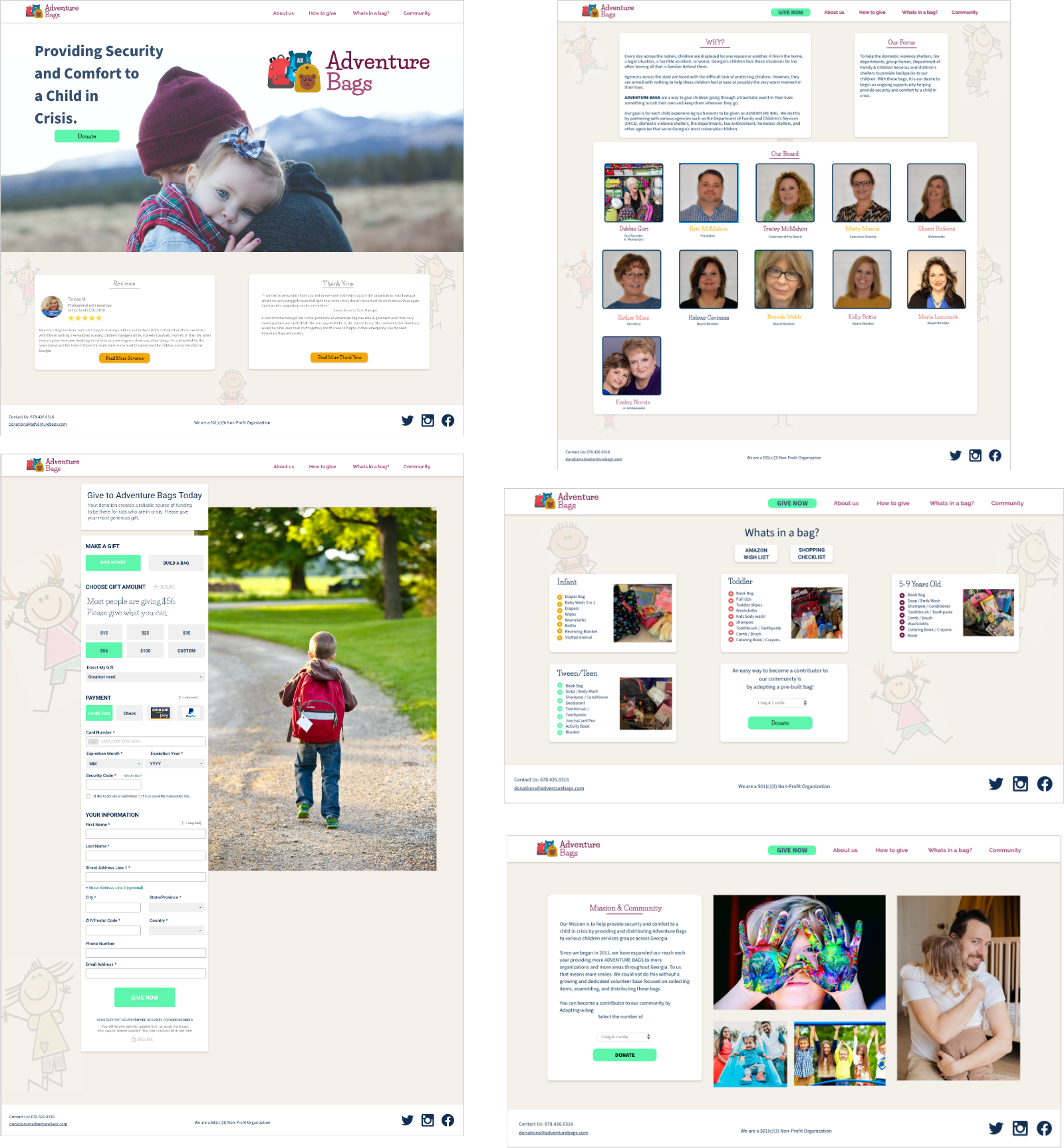
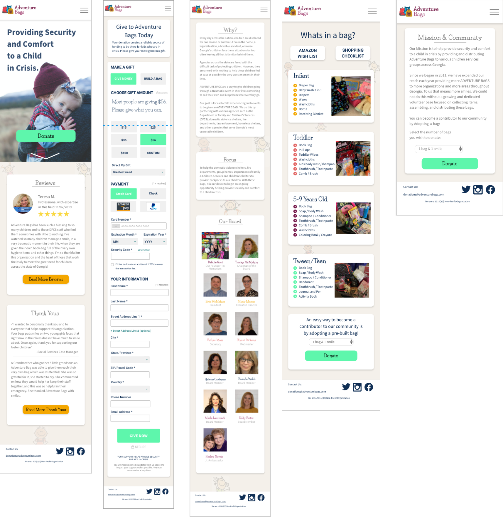
Mid/Hi-fi Prototyping:
Once we had our wireframes completed, user testing was completed to find any issues users might be having. From these testing results we were able to come up with mid-fi prototype and then move into hi-fi prototyping.
- Navigation was much more streamlined, far less cumbersome.
- The new pictures and color scheme carried a lot more emotional weight.
Desktop:
Mobile:
Key Takeaways:
This project was a success. The goals that I had set for the site were all accomplished leaving the Adventure Bags site with an easier to navigate & scan, cleaner website. One major impact point I learned was the importance of designing mobile first.
In the future I would continue testing and iterating the site, focus on donation conversion, and add more functionality to the site.